20 Effective Product Page Examples (+ Best Practices)
How do you make your product pages stand out?
What unique details can you add to these pages to make them resonate with your customers?
Most importantly, how can you optimize your product pages for higher conversions?
We’ve curated 20 effective product page examples to help you find answers to these questions and improve your product pages.
Be sure to read to the end. We share best practices for making your product pages stand out and increasing sales.
Let’s get started.
Creative Imagery and Design
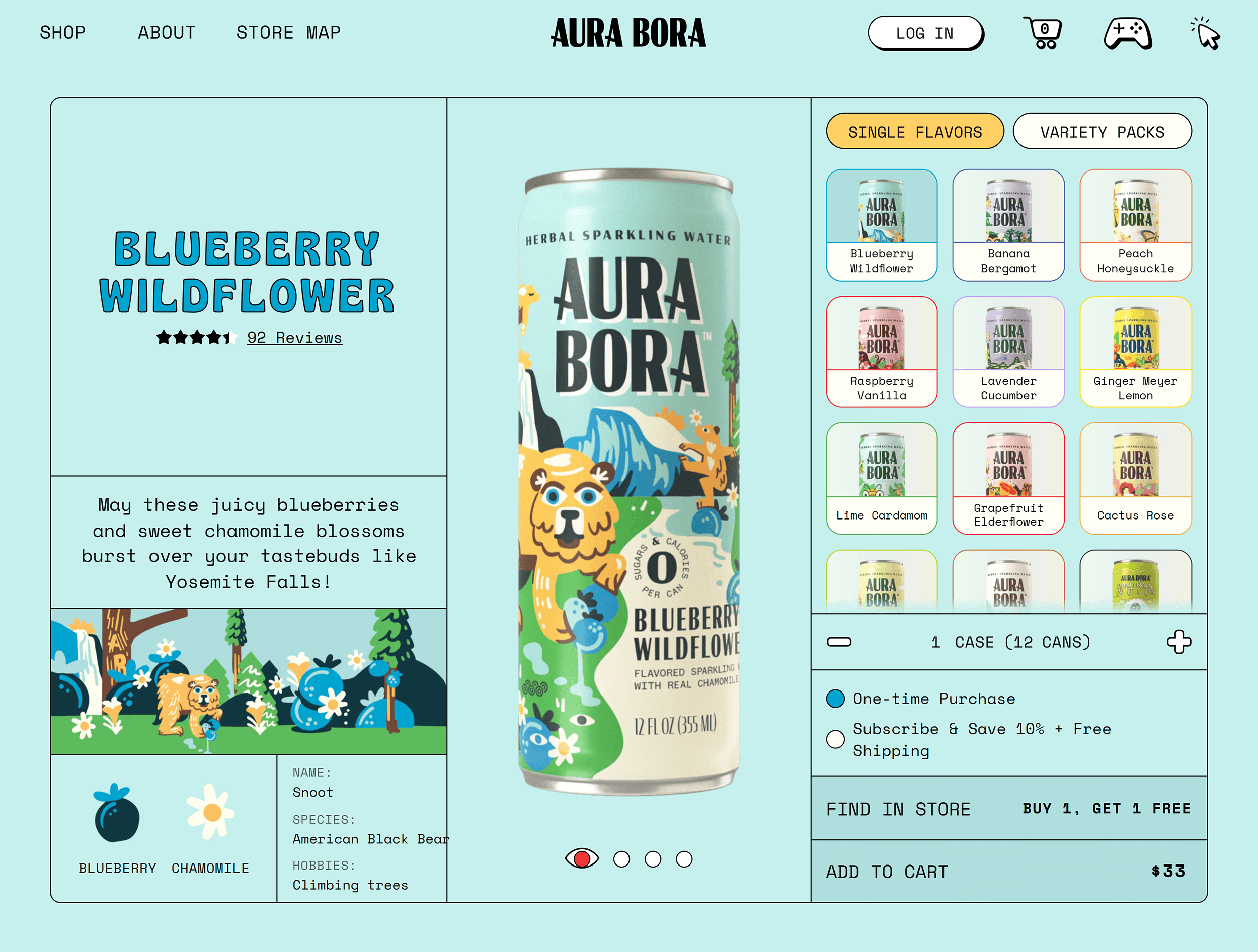
1. Aura Bora
Aura Bora sells sparkling water made with fruits and herbs. Its quirky brand personality is reflected in its packaging and website aesthetics.
On the left of their product pages, you’ll see a similar illustration to the one painted across that specific can. The entire product page uses the same color palette as this design to create a consistent theme.

The custom fonts and designs make this page stand out from other generic product pages. And they’re great for building brand recall.

Besides fun aesthetics, you’ll also find some unique details across the page—like tasting notes and a haiku describing each flavor.

And a percentage of people recommending the product (83% in this case).

Auro Bora’s branding played a role in securing a deal on Shark Tank in 2020.
Renowned entrepreneur and investor Robert Herjavek said, “This might be the best branding we’ve seen in all 12 seasons.”
What You Can Learn from Aura Bora
- Implement your brand’s personality traits through designs and illustrations that match your vibe
- Showcase your packaging on product pages to capture buyers’ attention
2. d’you
d’you is a skincare brand with a minimalist design approach. The brand has a limited collection of products, each represented by a color.

For example, the product “Good Grease” is expressed by peach and pink colors.
All the main elements on the page (like the icons, images, and text) are in different shades of that product’s color.

This page also uses visuals to show the product in action.
For example, the section on using the product visually explains when to use it and in what order, if you use the brand’s other products too. Which is a useful way to highlight more of the lineup.
This section also includes a short video showing how to use it (and how much to use).

All of these details make it super easy for potential customers to understand exactly what they get with this product. And it answers some common questions upfront.
The page also includes customer reviews categorized by ratings. Shoppers can click each rating bar to show only reviews that correspond to specific star ratings.

What You Can Learn from d’you
- Take a minimalist approach to product page design by creating color-coordinated pages
- Use simple videos, illustrations, and review sections to make it easy for users to find the information they need
3. Wanderlust
Wanderlust is a health and wellness brand that sells supplements and herbal extracts. This product page is a great example of a primarily monochrome design.

The hero section shares all the essential details with crisp copywriting. You’ll find the product’s name, a short description, and a few lines on its benefits.
This section gives buyers an overview of a product right within the first scroll.

As you scroll down, there are drop-down menus with more information about using the product. Along with important information about its ingredients and any associated health warnings. The drop-down menus provide detailed product insights without making the page too text-heavy.

The page also shares a description and illustration of the main ingredients used. Sharing insights about the main ingredients helps buyers understand the product’s benefits and sets clear expectations.
https://www.leadbuildermarketing.com/20-effective-product-page-examples-best-practices/


Comments
Post a Comment